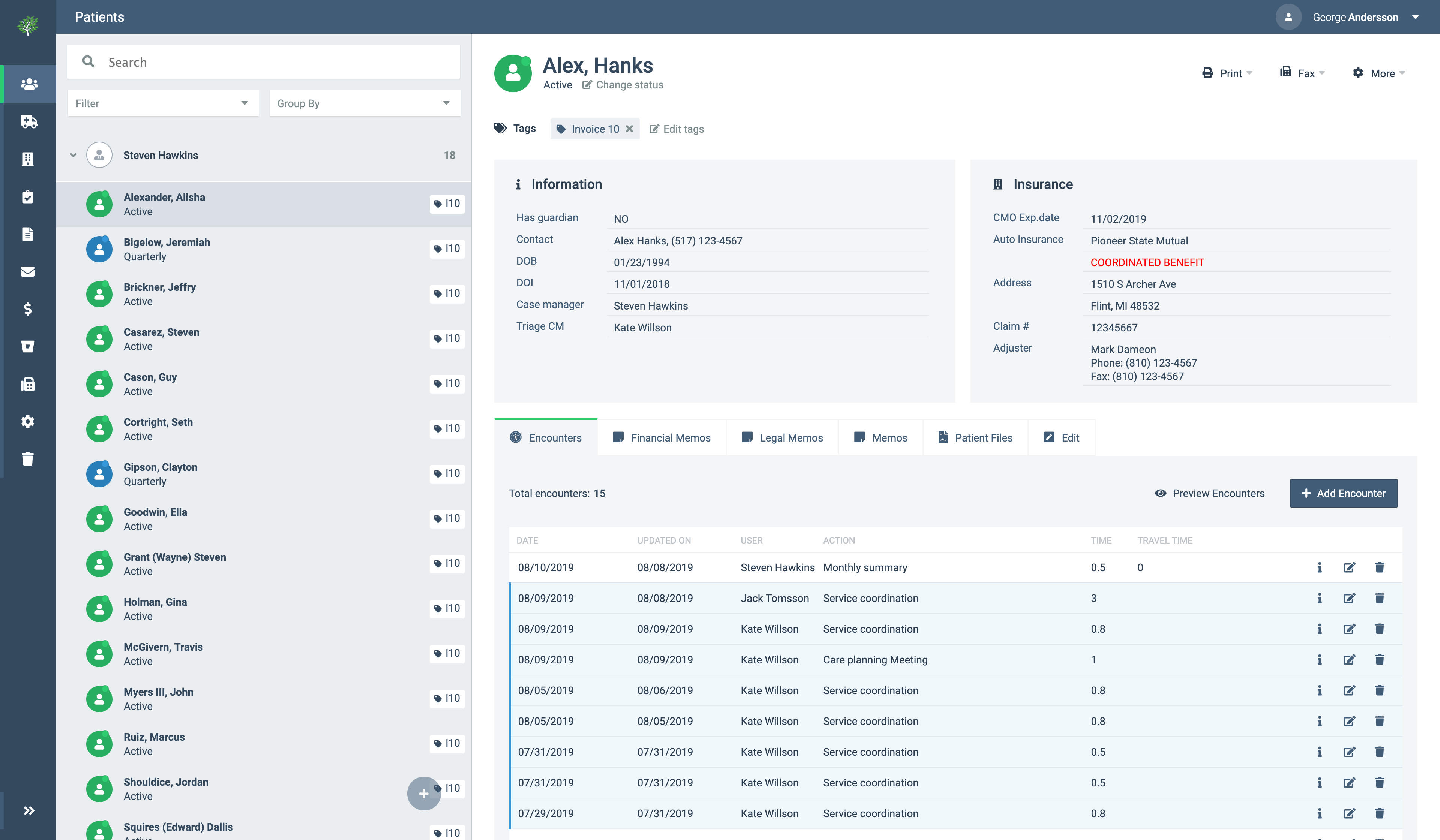
Redesigning the UI was a challenging task since the platform isn't developed in a modular & scalable way as today's libraries or frameworks are. The goal was to take the current state of the software, improve its usability and user interface.
Before starting with a new design artboard in Adobe Xd, I had to learn the platform's current implementation to know what to modify and improve.
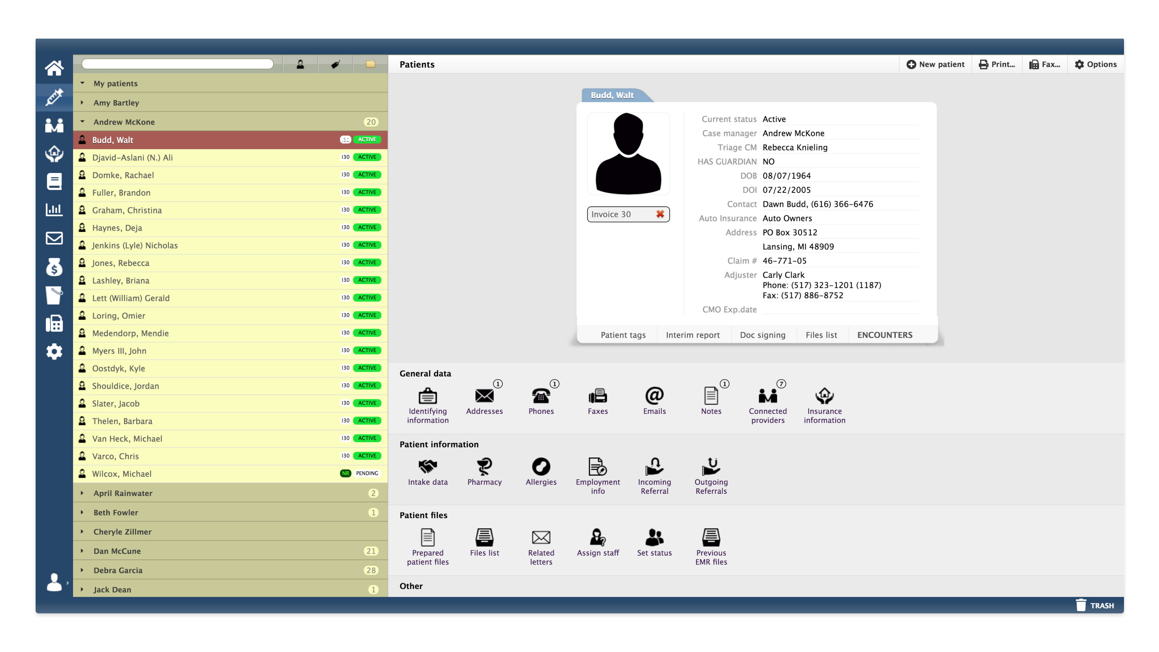
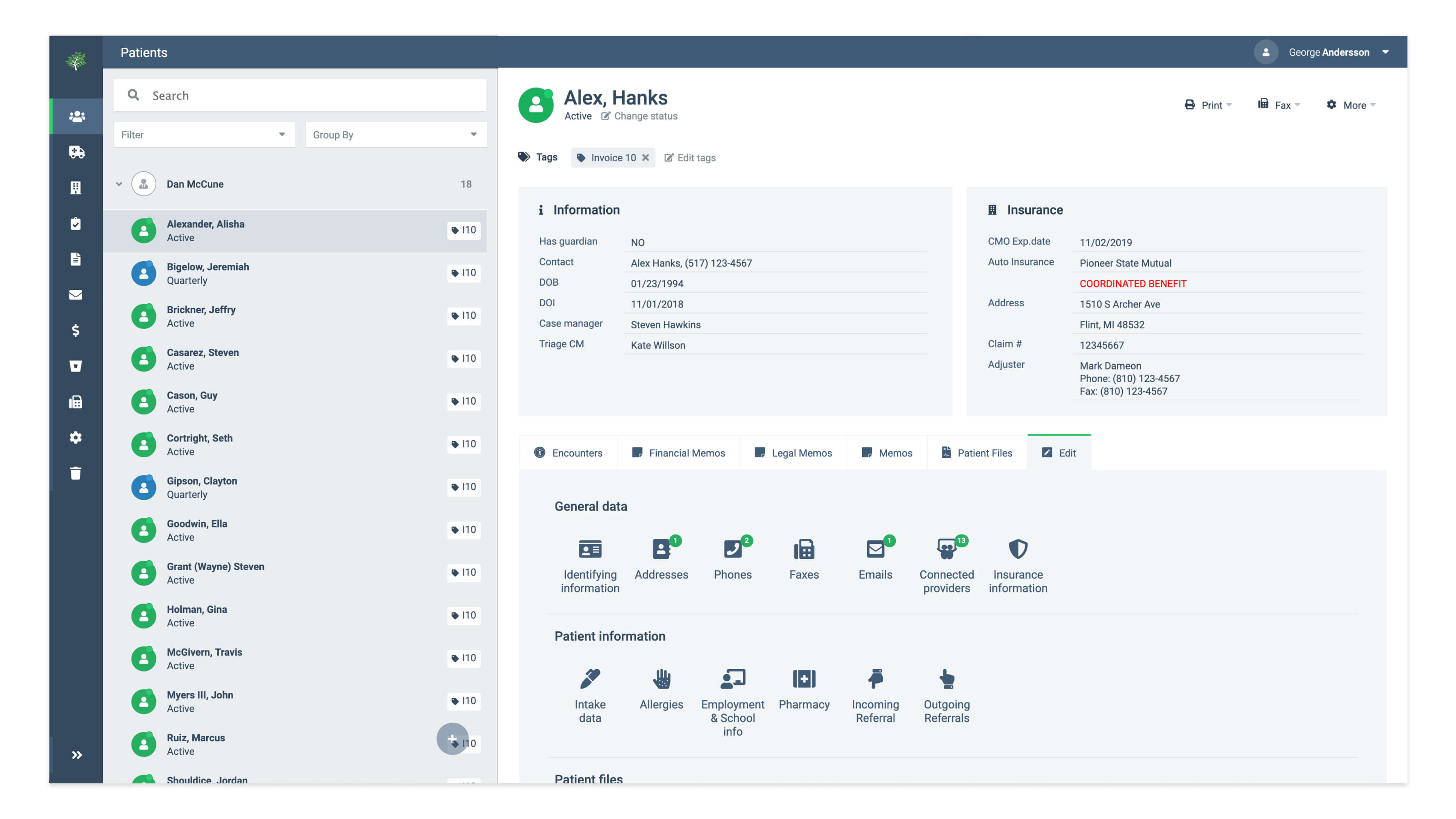
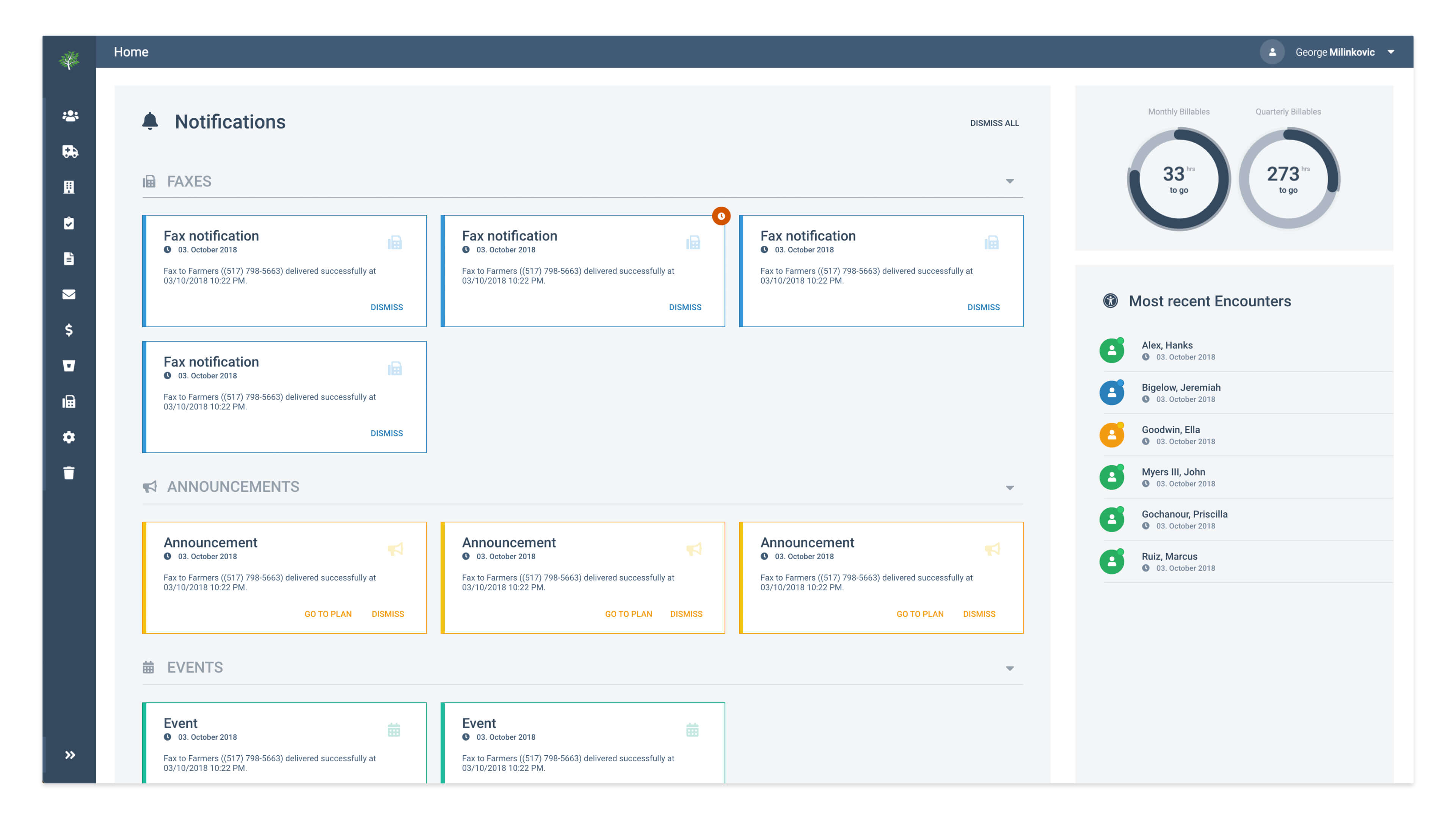
The changes are in regards to the information architecture, the use of colors, icons, font size, spacing, accessibility, consistency, etc. The new UI involved designing new dialogs, forms, menus, navigational bar as well as removing unnecessary elements. Meanwhile, there were certain requirements for new features that I also designed. Those features include billable hours widget (the circles in the dashboard), a much larger and distinguishable notification system, etc.
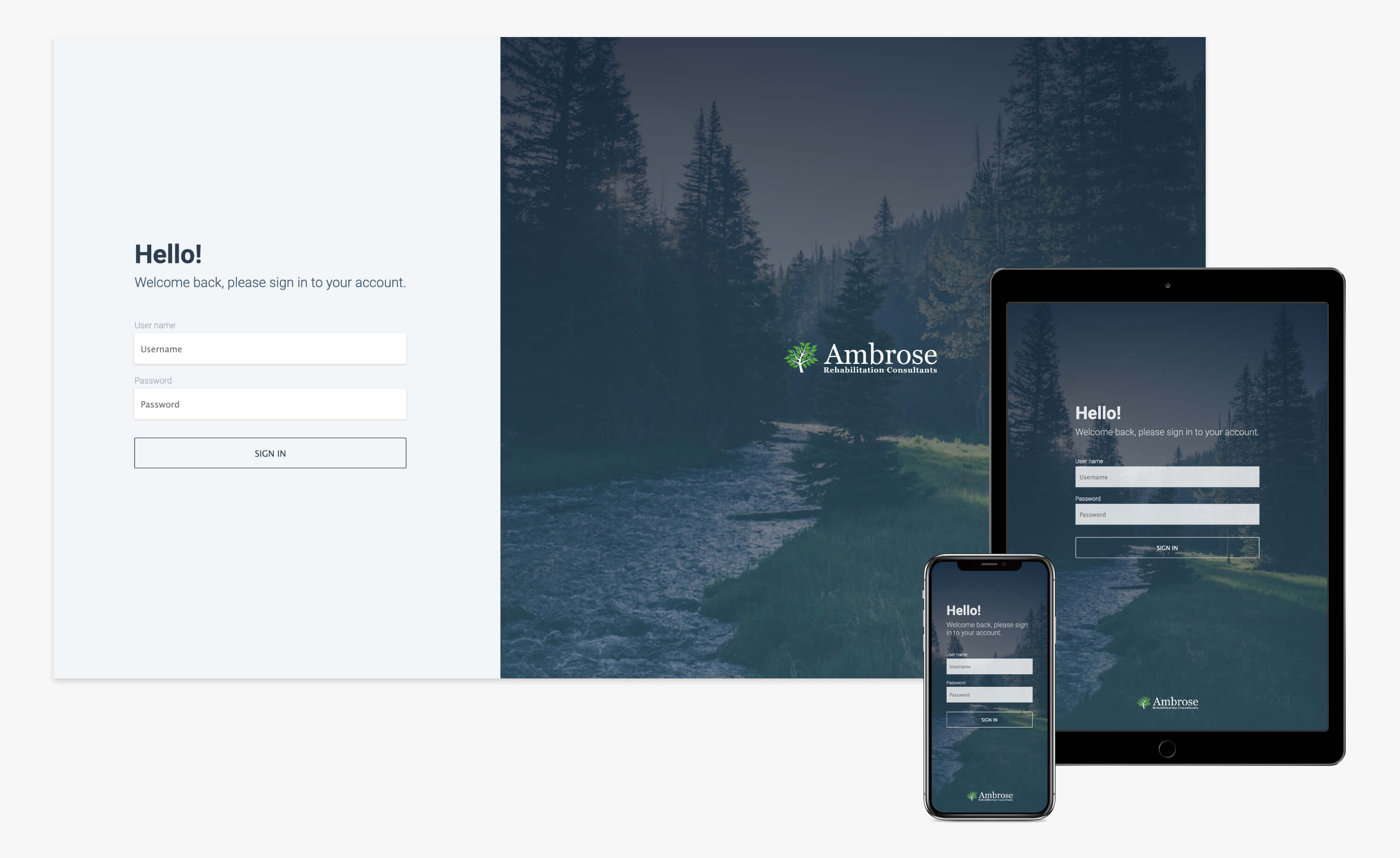
Since the beginning, the platform is designed and developed to be used on a desktop computer. However, due to the increasing usage of mobile devices, there is a need to accomplish certain tasks on the go. The responsive design is gradually being developed focusing on the core functionalities first.
The platform is developed using Symphony, a PHP framework, along with the templating engine TWIG. The front-end, however, is written in JavaScript, jQuery, and CSS. Modifying the current UI meant digging in the current implementation and not breaking the rest of the application.
I have introduced the LESS (CSS preprocessor) to the project which allows faster and powerful styling. To modernize and be consistent with the use of icons, I have included Font Awesome, as a great provider of vector icons.